Productization
The Embedded Resume Device would have been interesting by itself, but I wanted to take it to the next level and give it the appearance of a real-life product, something that could actually be on Target’s shelves. I didn’t want to just shove some ESD bubble wrap on it and throw it in a UPS box; this was my first impression to employers, and if I was going to do this, I was going to do it right.
Photography
One of the most important aspects of making this look like an actual product was creating stunning product photography to show it off. Photography is a field that I have always been interested in but have never had time to explore, until now.
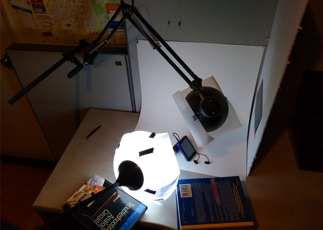
I spent months watching YouTube video after YouTube video and researching the tricks professional photographers use to get those breath-taking shots. After a bit of practice, I decided it was time to shoot the cover photo for the actual device. Using the knowledge I had gained, I set up the following simple backdrop.
Photoshoot Staging
Disclaimer: I am by no means a professional photographer, so take everything I say here with a grain of salt. I simply want to outline a few tricks that helped me take some good pictures.
Lighting
I went with a simple setup of two light sources and bought identical “cool” tone light bulbs for both. Pure lamp light produces harsh shadows on your subject, so I used a simple sheet of paper to diffuse them and give the scene a softer feel. This was shot on my lab bench with blackout curtains over the windows and all other light sources shut off to prevent different tones of light from sneaking in.
For the actual device picture, I positioned the lights so one lamp acted as a general source, illuminating the rear and side of the case. My architect lamp was used head on to brighten the face of the device and bring out its colors.
One trick I learned from YouTube videos was to place a plain, white foam board next to your subject just out of frame. This will reflect light back onto the object and help further brighten the shot.
Backdrop
Another tip from YouTube was to use a simple poster board as the background. This should be sort of propped up against a wall, so that there is a smooth transition going from horizontal to vertical. This gives the illusion of an endless white background.
For the dark theme shots, I picked up a few yards of dark black fabric at JOANN and positioned it in the same manner. As you can see in the picture above, the type I chose had a large thread pattern that I had to spend a lot of time taking out in post-production. Ideally this should something like velvet with a high thread count.
Smoke and Mirrors
This was still in April of 2020, and (much like the 3D printed case) I was rushing to complete this step, because the world was in such a volatile state due to COVID. I didn’t want the low-volume packaging manufacturers to shut down before I could get my designs through.
The only problem was that I had absolutely nothing except 10 physical cases and a box of LCDs; I hadn’t even started the electronic design of the PCB yet. If my months of research had taught me anything, it was that professional photographers lie through their teeth (metaphorically speaking) to get those great shots. From covering products in water to using smoke bombs, the fancy effects you see in commercials are completely fabricated.
Since I was working with nothing, I had to fake it till I made it. I cut off the header pins of the LCD breakout board and squeezed it into the device’s case. I was using the prototype version of the case to avoid damaging my only 10 production units, but it didn’t even have a headphone hole. I sawed off the metal jack of an old pair of headphones and just hot glued the remaining part to the top of the case where it should go. The cord was still too long, so I chopped it off and stuck the bulk behind the case. I positioned the remaining 4” of actual earbuds in front of the case such that they were at nice, smooth angles to the camera.
A second device (just a shell without any LCD or electronics) was used to prop up the primary one and form and interesting pose. Finally, a score card (just a dark piece of an old notebook) was taped in front of the screen to give it a that professional diagonal reflection present in cell phone product photography.
All said and done, I was blown away with how well the final shot turned out.
Photoshop
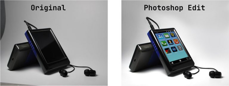
One of the pieces of software that I used extensively throughout the project was Photoshop. I spent months learning tips and tricks of post-production and how to spice up boring pictures. This was especially helpful for the product box as well as the vast number of pictures taken while creating this website.
I have used Photoshop in nearly every aspect of this project including creating homescreen app icons, making a bitmap font, cutting objects out of images, swapping out portions of images (like the ugly headphones in the picture above), recoloring, cloning different backgrounds and much more.
Product Box
I wanted the Embedded Resume Devices to have an eye-catching product box. After all, this is the first thing a potential employer would see after opening the main shipping box. I didn’t want to just cram everything in a generic brown package and call it good.
The first step was to find a company capable (and willing) to produce this. Most packaging manufacturers are used to dealing with volumes in the 10s or 100s of thousands, and the vast majority I found had minimum orders like 1000.
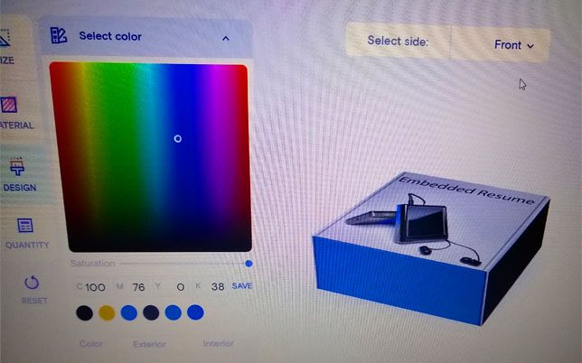
Finally, I found a low volume package manufacturer who offered fair prices with an easy online design tool.
Design and Marketing
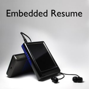
The box I chose is 6” x 6” x 2”, which is just big enough to hold the main device and all of its accessories. The main cover was taken from the photoshoot described in the section above with a bit of post processing to make it more appealing.
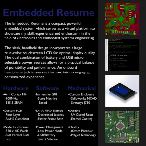
The rear cover was a bit more difficult. I am many things, but marketing professional is not one of them. I wanted the back to give just enough information that the reader would understand who I was and what this crazy device was about while also not being totally dry.
Also, I tried my best (if you’re in the marketing department reading this, I’m terribly sorry) to use impressive-sounding marketing terms to spice things up a bit. Admittedly it may have come out sounding a bit like one of those get-rich-quick-scheme commercials, “with only five easy payments of $19.95.” That said, I’m not applying for a marketing position and I think I did a fairly okay job.
The real hard part was that, just like the first product photography, all of this was taking place in April 2020 before I had even started a schematic or written a single line of code. I put a lot of promises on that box (DMA, state machine GUI etc.) which meant that I absolutely had to include those in the final product. Luckily, I fulfilled all of these and didn’t run into any huge snags.
Custom Foam Inserts
Oh, the custom foam inserts; I’m certain the leading cause of my impending stress-induced heart attack will be these.
From the second I started this project, I knew one of the most appealing elements that I wanted were those form-fitting, dark foam packaging inserts. How underwhelming would it be if a potential employer opened the fancy product box only to find the actual device bouncing around like the last M&M in the bottom of the bag? I wanted them to open the box and have that “oh my gosh” feeling of luxury.
I had absolutely no idea how I was going to pull it off, but I was determined to find out or die trying.
Planning and Prototyping
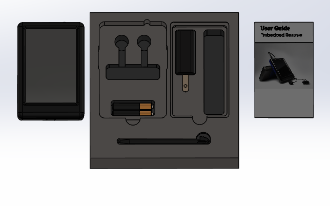
The foam inserts that I was envisioning would slide into the product box and have a perfectly shaped cutout for the Embedded Resume Device and each of its accessories: USB charger and cord, stylus, headphones, AAAA batteries and a user manual. I created exact 3D models for each of the accessories and used them to create a perfect mockup of the foam inserts in SolidWorks.
I researched every possible method under the sun of doing this, but most of them revolved around “Pick and Pluck” foam which would have left ugly, square holes. I finally found a method where a solid foam block was placed under a CNC router and each shape was precisely cut to spec.
I spent the next week learning more than one should ever know about foam, CNC routers and where I could go to get this done. This was now October of 2020, and everything in California either had already been closed or was just starting to close again due to COVID. After days and days of searching, I finally found the only makerspace still open in a 100-mile radius with a CNC router. After purchasing a membership and driving 1 ½ hours, I found myself in front of a Shopbot Buddy CNC router and a makerspace director who nodded politely at my crazy idea.
The picture to the right is the first prototype. I still had a lot of work to do to make this look right.
Final Design and Tips
I put the electronics and firmware design momentarily on hold and spent the better part of three weeks getting off work, driving to the makerspace, milling out a new iteration then getting home around 10:30pm and correcting my CAD files for the next day. On my lunch break I would watch videos and study articles on ways of improving foam milling designs. Although I was a bit of a zombie afterwards, my hard work paid off, and I came out with amazing foam inserts that were even better than I had expected.
Here are a few tricks I learned along the way:
- Use a high-density EVA foam; softer composites tend to warp, melt, or get eaten by the router
- SolidWorks and other professional MCAD tools have a steep learning curve to design CNC toolpaths. Use something like VCarve instead, which lets you simply set the depth of 2D vectors and the CNC will turn them into plunge cuts.
- Feed: 1 – 3in/s, Speed: 15,000rpm
- Use a two-flute, down cut mill and set the router to “conventional” mode
User Manual
Inside the product box is a custom user manual outlining the device’s features and explaining how to interact with it. Since the whole project is a bit obscure, I wanted to make sure that the end user didn’t end up with a fancy paper weight that they had no idea how to use. I settled on a fold-out pamphlet format that would allow me to allocate a single page for each topic.
The sections were fairly straight forward to write, and I was able to whip up a few fancy animations in photoshop. The only really difficult part was creating a set of instructions for the quick start guide that someone who had never seen the device could actually use. After a bit of makeshift user testing (by bribing my roommates with food), I was able to edit the design down to a succinct yet informative pamphlet.
I knew I wanted these professionally printed on fancy 100lb gloss paper, like you find on a magazine cover. After a bit of searching, I found a printing house willing to send me a pack of 50 for a reasonable price.
Accessory Sourcing
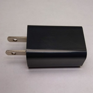
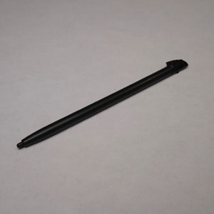
The Embedded Resume Device has a few accessories which would have been downright ludicrous for me to try and supply/build myself. In order to avoid having to create my own touch screen styluses for example, I shopped around for an original equipment manufacturer (OEM). This is a fancy way of saying a company that makes a finished component that you include as part of your final product. For example, if BMW is selling their new model, they’re more than likely just going to buy the tires from an OEM.
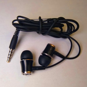
I wanted to keep the theme colors the same, which meant that everything I chose had to be black. Furthermore, I didn’t want a different brand’s logo all over each accessory, so I specifically chose ones that did not include this but were still quality.
The two hardest parts to source in volume were the headphones and USB cable. I actually ordered about three different types of headphones before settling on the ones above, since many of the ones produced in volume were of absolute terrible quality. The USB cable was difficult simply because I had to interface to the USB-UART converter on the PCB. Some cables (even though they included signal lines, not just power) simply would not form a connection with the PC. After a few different models, I finally found a version that worked perfectly.
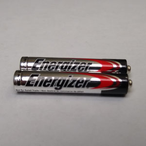
I also specifically chose name-brand batteries because that’s not really a place where you want to cut corners. The system was already pulling way more current than what these things are used to, and I wanted to make sure the device stayed powered up as long as possible.

