Mechanical Design
The mechanical design of the embedded resume device was arguably one of the most important aspects of the project. This, in combination with the display, would define the entire look and feel of the product.
It consisted of the combination of elements in the outer shell of the device. There was a balance that needed to be achieved between structural functionality (ie. securely containing and protecting the electronics) and aesthetic appeal to the user.
Capabilities
After looking under my couch cushions and digging through my spare change jar, I came up about $30,000 short for custom plastic injection molds; I was going to have to figure out a different means of producing the device’s case. Luckily for me, my university had recently opened an innovation center complete with state-of-the-art laser cutters, 3D printers, high resolution 3D scanning cameras and a multitude of other expensive toys.
If you can’t get custom plastic molds, your next best option is probably a half-million-dollar resin 3D printer with full RGB color capabilities, 0.014 mm accuracy, and a bed large enough to print an engine block.
There were two main advantages for using this machine for the embedded resume cases: small layer height and design flexibility.
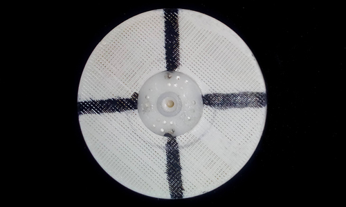
When a 3D object is being printed, it is conventionally done one layer at a time. Simply put, this means your model is sliced into hundreds or thousands of small layers and each one is stacked onto the one below it. The problem then is that these lines often show through in your finished print and look rather off-putting. With the J750 however, these lines are extremely small, and the final product appears much smoother.
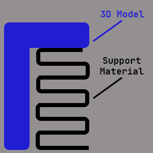
The second problem with traditional 3D printing is that designs are limited to models with steep angles. If one wishes to create features at or near 90º, support material (hollow, honeycomb structures) must be placed beneath them.
This often leads to inaccuracies or blemishes from removing the supports. Again, with the J750 this is not a problem, and the user is free to design more complex objects.
Along with these printing capabilities, I was lucky enough to have
access to a full suite of SOLIDWORKS 2018 Student Edition. I had used this
software extensively in the past and could quickly pick up and
modify designs.
Less than Ideal Circumstances
Take yourself all the way back to March of 2020; COVID-19 had just began to make its way through the United States. Classes had transitioned to virtual learning, and my university’s on-site services were diminishing daily. The innovation center was running at limited capacity, and most machines had already been taken out of operation.
I could see the writing on the walls and knew that it was only a matter of time before I lost access to the expensive, feature-rich 3D printer I needed to complete this project. This meant that I could not spend very much time planning, iterating, and perfecting the design as I had originally hoped.
Although I am pleased with the final product, the inability to iterate the mechanical design as the electronics developed turned out to be one of the most difficult constraints of the entire project.
Updated Design Requirements
- Easy access to the circuit board
- Means of inserting/removing batteries
- Single physical button
- Headphone cutout
- Micro USB slot
- Housing for the main screen
Planning and Prototypes
The most important goal while designing this case was to make it look as much like a professional consumer product as possible. Typical 3D prints have a very unfortunate, distinct look that screams, “unfinished prototype”.
With the help of the Stratasys J750, I was hoping to avoid this. I wanted a look and feel that would wow potential employers, something that they could picture sitting on Target’s shelves.
Not only did the case have to be aesthetically pleasing, it also had to stand up to a fair bit of harm the typical user could inflict. Another main purpose was to provide a secure housing for the screen and all of the electronics.
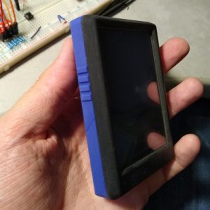
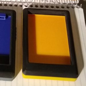
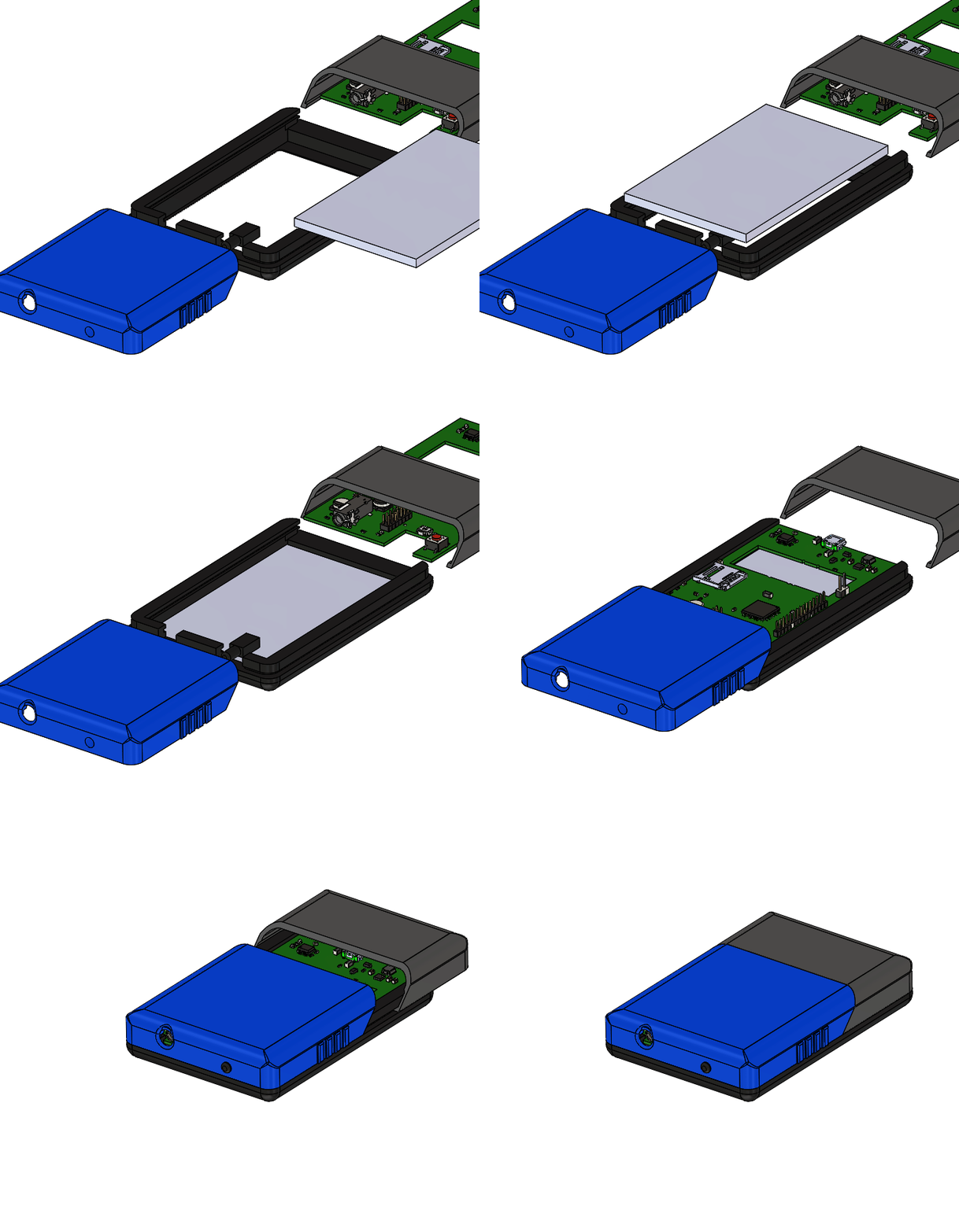
With all of this in mind I created a simple, yet elegant three-piece design that fit most of my needs. The only real design constraints here were the overall dimensions of the TFT display that I had already selected. There were two version, one in a golden yellow and another in purple.
The Final Design
The initial prototypes came back looking better than I had expected, but there was still a lot of rework to be done in order for the models to be complete. To make matters worse, the COVID-19 situation was escalating exponentially, and I knew I had very little time before the innovation center closed completely.
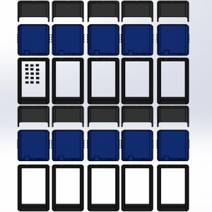
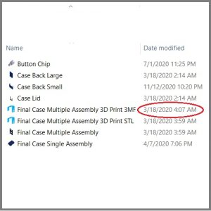
For this reason, the same day that my initial prototypes were given back to me, I stayed up until 4:00am correcting features and adding necessary final details. I then took the design and repeated all three pieces over the entire printer bed, resulting in exactly ten individual embedded resume shells.
After submitting my designs, the 3D printer operator told me that I should go home and pick up my models the following day, as it would take the majority of the afternoon. I had a bad feeling about the campus closure situation, so I waited outside for about 4 hours and picked up the prints right before closing time.
The following morning, I woke up to an email stating that the entire campus would be indefinitely closed. I’m not sure if Nikola Tesla himself was watching over me, but if I had waited another 12 hours, I could never have picked up my prints. The project would have been dead before it ever started.
Final Case Sections
Main Body Frame
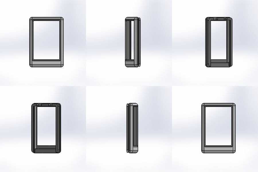
The main body frame acts as the primary support structure for the device. It consists of a simple rounded rectangular prism with a slot for the main display. The LCD drops in from the rear of the frame and sits just below its front surface, much like a cell phone.
There are also two sets of grooves along the rear surface. The first is used as a guide rail, allowing the two back plates to slide and lock in place. The second set is located on the inside of the frame and is used as a slot for the custom PCB.
Finally, a set of strategically placed rectangular holes have been cut out of the edge of the frame in order to allow a access for the main power button and headphone jack.
Upper Back Plate
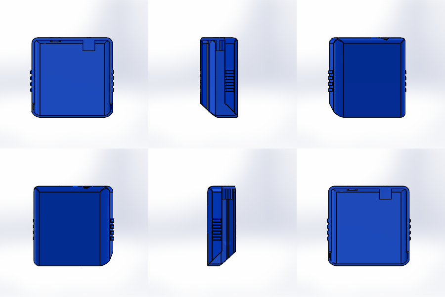
The upper back plate was specifically designed to be removable and allow the user to view the main circuit board. It has a rail along its inner edge that slides onto the mating groove of the main body frame.
There is a hollow rectangular housing attached to the top edge, which allows a small button to slide in and out of the frame. In this manner, the user can press the main power button from the outside, and it will subsequently contact a push button on the main circuit board.
A small circular hole is cut into the top edge as well. This aligns perfectly with the headphone jack on the PCB and allows the user to access the device’s audio interface.
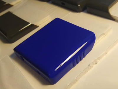
Finally, I wanted this piece to add a bit of visual flare to the overall design of the device. I gave it three simple, yet elegant decorative side grips and colored the entire piece royal purple.
One of my greatest self-criticisms for this part is that it is a bit too thick for my liking. The whole design could have been a bit sleeker if I had been able to use a thin LiPo battery. Since I was forced to use AAAA alkaline batteries (see Hardware), I had no choice but to give this portion extra clearance.
Lower Back Plate
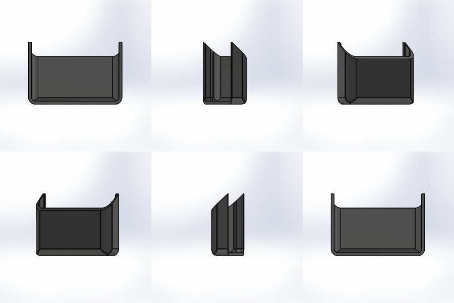
This section of the case is nearly identical to the upper back plate with a few minor differences. First, the overall length of the piece is shorter. It would be used as an access point to the battery compartment which sat directly on the PCB below it. It therefore only needed to be as wide as two AAAA batteries side-by-side.
Making this section shorter than the upper back plate also makes the overall design much more aesthetically pleasing.
The lower back place only has a single cutout, which is used by the device’s micro USB power source. I also designed the piece to be a dark gray, which complimented the deep purple of the upper plate. Both of these in combination with the pure black main body frame formed a nice color scheme.
Post Processing
Initial Sanding
After the cases came out of the 3D printer, they were still a bit rough. One technique to get rid of the print layer lines is to simply sand them off. I carefully wet sanded the models with the following grits: 220, 400, 500, 1000, 1200, 2000.
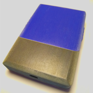
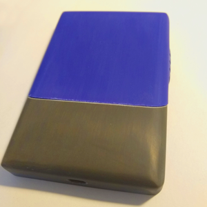
The key here is to make sure the piece is extremely wet. You also have to avoid sanding off small features, especially with the lower grit paper, like 220. Overall, each three-piece case took about 2 – 3 hours to bring to a matt polish surface.
Final Clear Coat
I went through about four different brands of clear coat trying to find the right finish. The main problem was that most cheap enamels from a spray can are fairly soft even after drying. This meant that I was easily able to scratch the finished product, which looked pretty bad. I finally landed on Dupli-Color Perfect Match automotive paint. It still isn’t quite as good as professional car paint, but it was the hardest clear coat I could find, so I went with it.
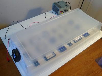
The other main problem was that during my test runs I would almost always end up with a few fibers or specs of dust in the cured coat. These looked pretty tacky in the final product, so I went a bit nuclear and whipped up the little device to the right.
This is just a large storage bin that I cut holes into. I glued commercial air filters over the gaps and attached a small fan to one end. Its purpose is to allow the sprayed models to get the fresh air needed to cure while also preventing any small dust particles from landing on the wet clear coat. (WARNING: Do not try this, since electrical sparks within the fan could theoretically ignite the paint vapors.) I also ran an air purifier for an hour before painting to get rid of any loose debris in the room. Admittedly, it looks a bit Frankensteinesque, but it actually worked very well.
